

Abstract watercolor sunset art makes the room come alive, especially in the spring, and you will absolutely love this print.
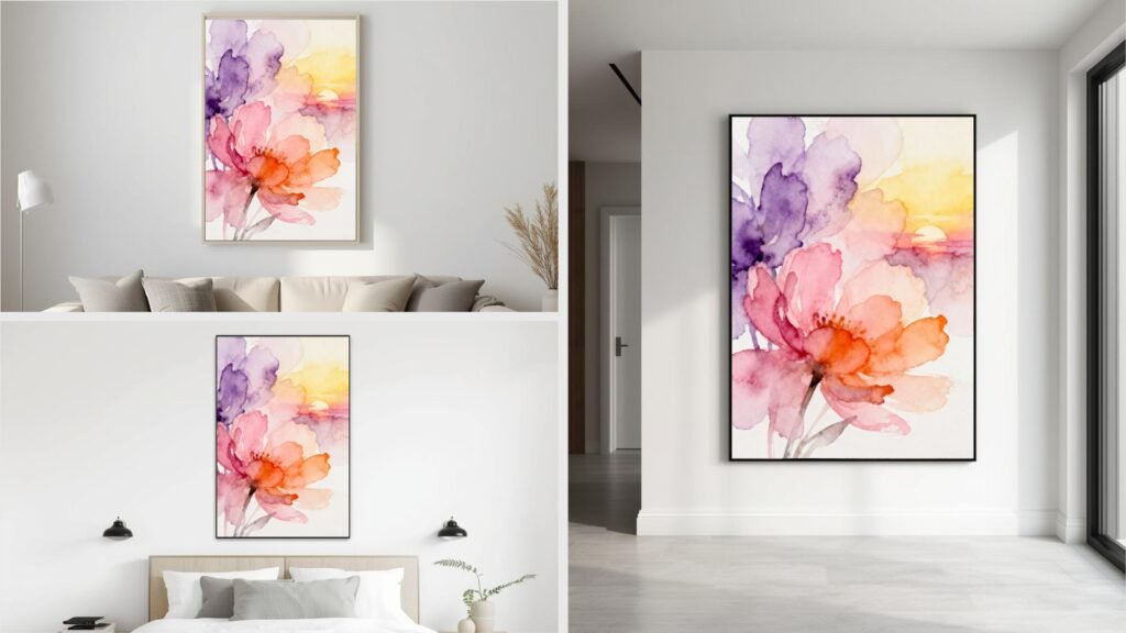
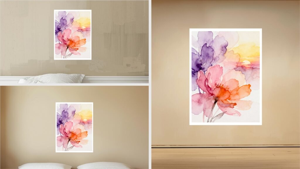
Spring living room wall art is something we plan for. This pieces mixes blush pink, lavender, pale yellow, and soft orange into gentle spring-sunset gradients.
If you’re looking for a statement piece to hang in any room, keep reading!
Abstract Watercolor Sunset
Minimalist wall art for the spring is about lines and gentle colors, but this piece is a little more bold.
This is a fine art watercolor print that captures the feeling of a spring sunset through soft pastel gradients, gentle floral textures, and a smooth matte surface.
As you see, the print is on high-quality 180 gsm paper that can be displayed in either direction and still feel balanced and refined.
It is good for adding light, warmth, and visual calm to spaces like living rooms, bedrooms, and offices, where the blend of soothing colors and subtle texture helps create a relaxed, inviting atmosphere while still looking modern and thoughtfully styled.
If you’re in the market for spring art, you should definitely get it because it gives you both beauty and durability, as the artwork not only lifts the mood of a room with its serene, uplifting glow but also holds up over time.
Of course, it also easily mixes into many wall art decor styles while quietly transforming the energy of your space.
Soft Spring Color Palette
The artwork centers on a soothing blend of blush pink, lavender, pale yellow, and light orange, arranged in flowing watercolor gradients that echo the gentle glow of a spring sunset.
These colors feel warm without being overpowering, creating an atmosphere that is calm, bright, and quietly uplifting.
As the tones fade into one another, the surface seems to breathe with light.
So, it gives the piece a sense of openness and ease that naturally draws the eye and relaxes the space around it.
Texture, Finish, and Paper Quality
A matte finish softens the overall look and prevents harsh reflections. It lets every delicate color shift to stay clear and balanced under different lighting conditions.
Subtle floral textures drift through the watercolor layers. For example, they add movement and a hint of organic depth without distracting from the clean, modern feel.
The print’s durable yet lightweight 180 gsm fine art paper means the piece is refined and well-made while remaining easy to frame or hang.
It works best when displayed vertically.
Atmosphere, Durability, and Interior Fit
Its scratch- and water-resistant surface supports long-lasting indoor use.
As a result, it makes it suitable for spaces like living rooms, bedrooms, or offices where beauty and practicality need to coexist.
The combination of contemporary abstraction and pastel spring hues gives the artwork a serene yet fresh personality.
For example, it mixes effortlessly with modern, minimalist, or eclectic interiors.
It brings a calming presence while still adding gentle visual interest, shaping a space that feels peaceful, airy, and subtly energized by seasonal light.
Follow the Pinterest page for more ideas.